OUR PROCESS
THE PROBLEM
The United Nations has outlined the 90-90-90 goal for healthcare organizations focused on treating HIV, and demonstrating progress towards this goal is important for them to receive continued funding.
Patient retention is a critically important factor in effective HIV treatment. Patients who lapse in their treatment may put others at risk for contracting drug-resistant strains of HIV. AMPATH-Kenya, a healthcare network in Western Kenya, collects patient data using an open source EMR that an internal development team built. We were tasked with helping them design data visualizations that could help them understand both their progress on the 90-90-90 goal and their patient retention data in order to deliver better care.
THE REQUIREMENTS
Our team conducted two remote requirements gathering sessions with the Chief Medical Information Officer at AMPATH to gain an understanding of the design context and understand the technical constraints.
WIREFRAMES
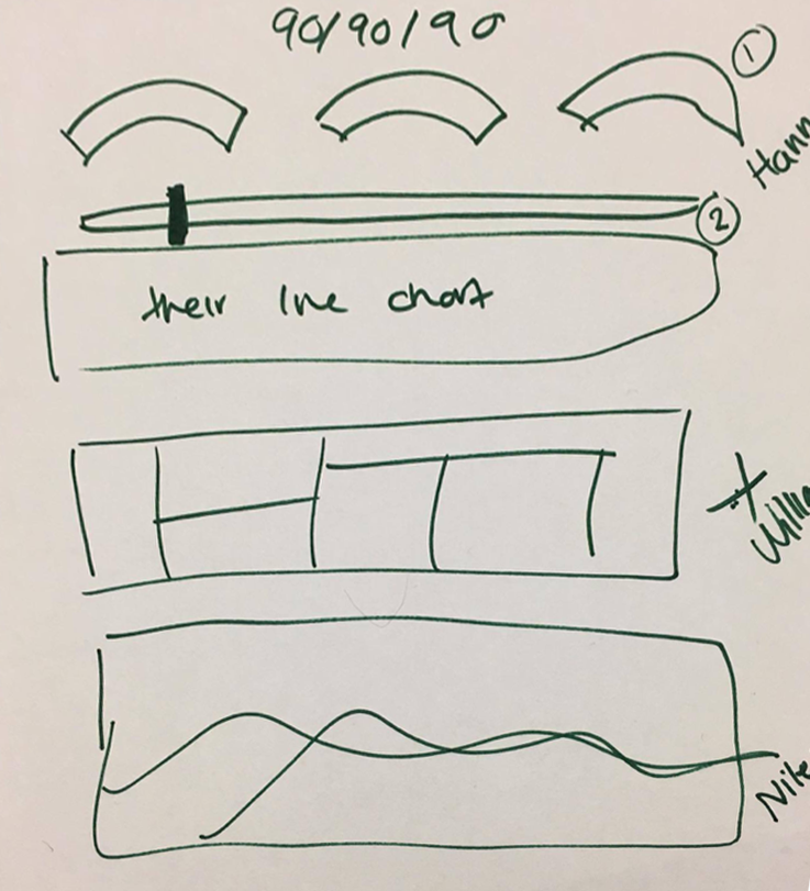
We explored visualization options with hand drawn wireframes.
ITERATION 1
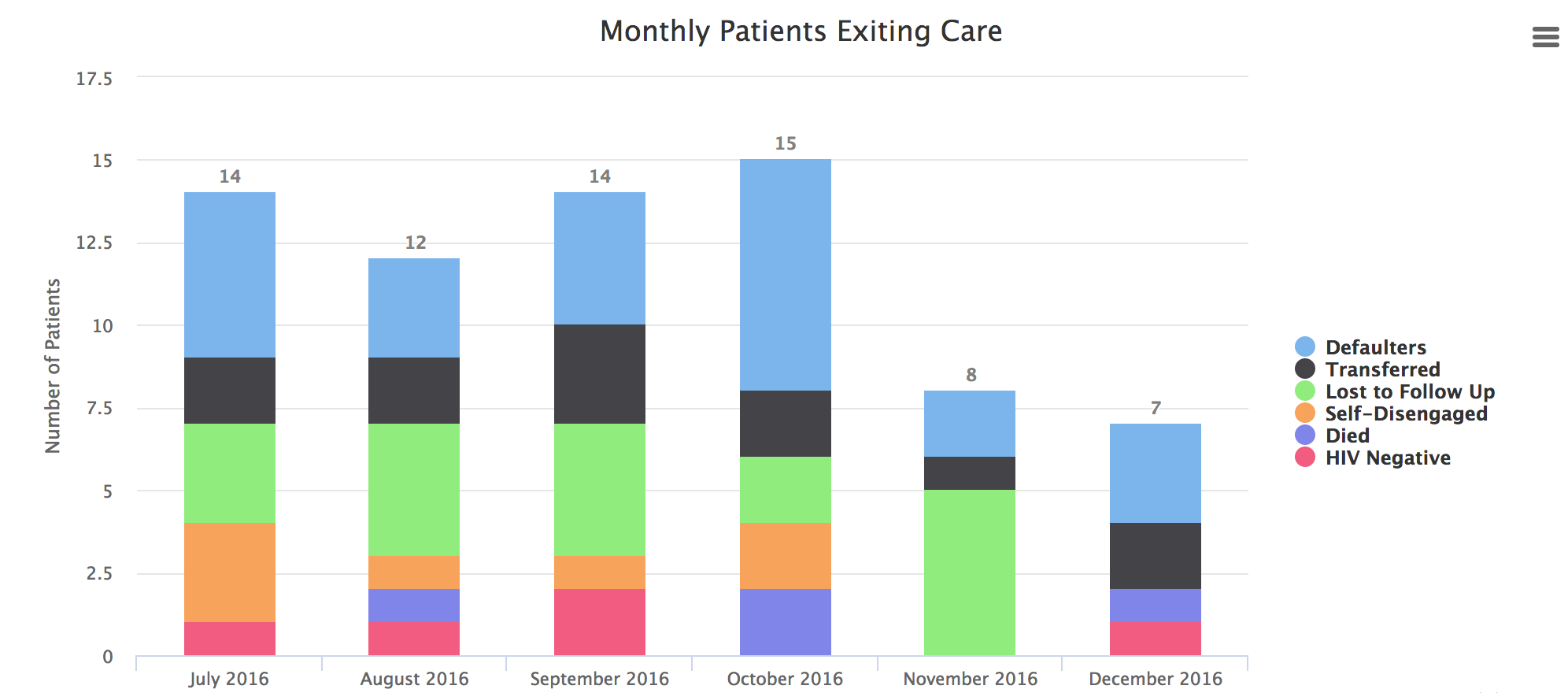
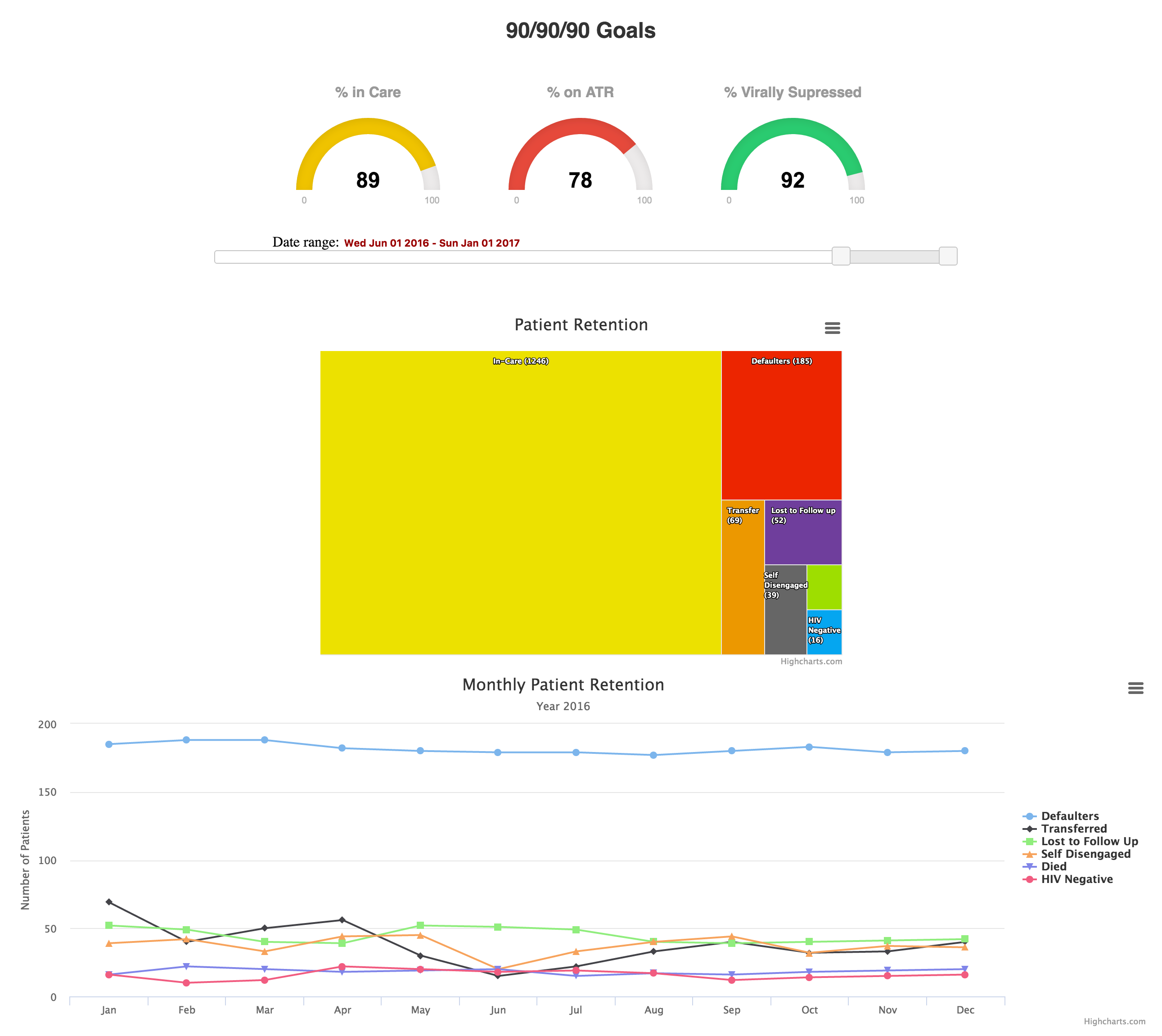
We presented our first prototype to AMPATH for feedback. The 90-90-90 visualization was well received and given to their development team to implement immediately. The two visualizations showing patient retention data required some re-working. In particular, AMPATH did not feel that the line graph communicated trends in the data clearly.
ITERATION 2
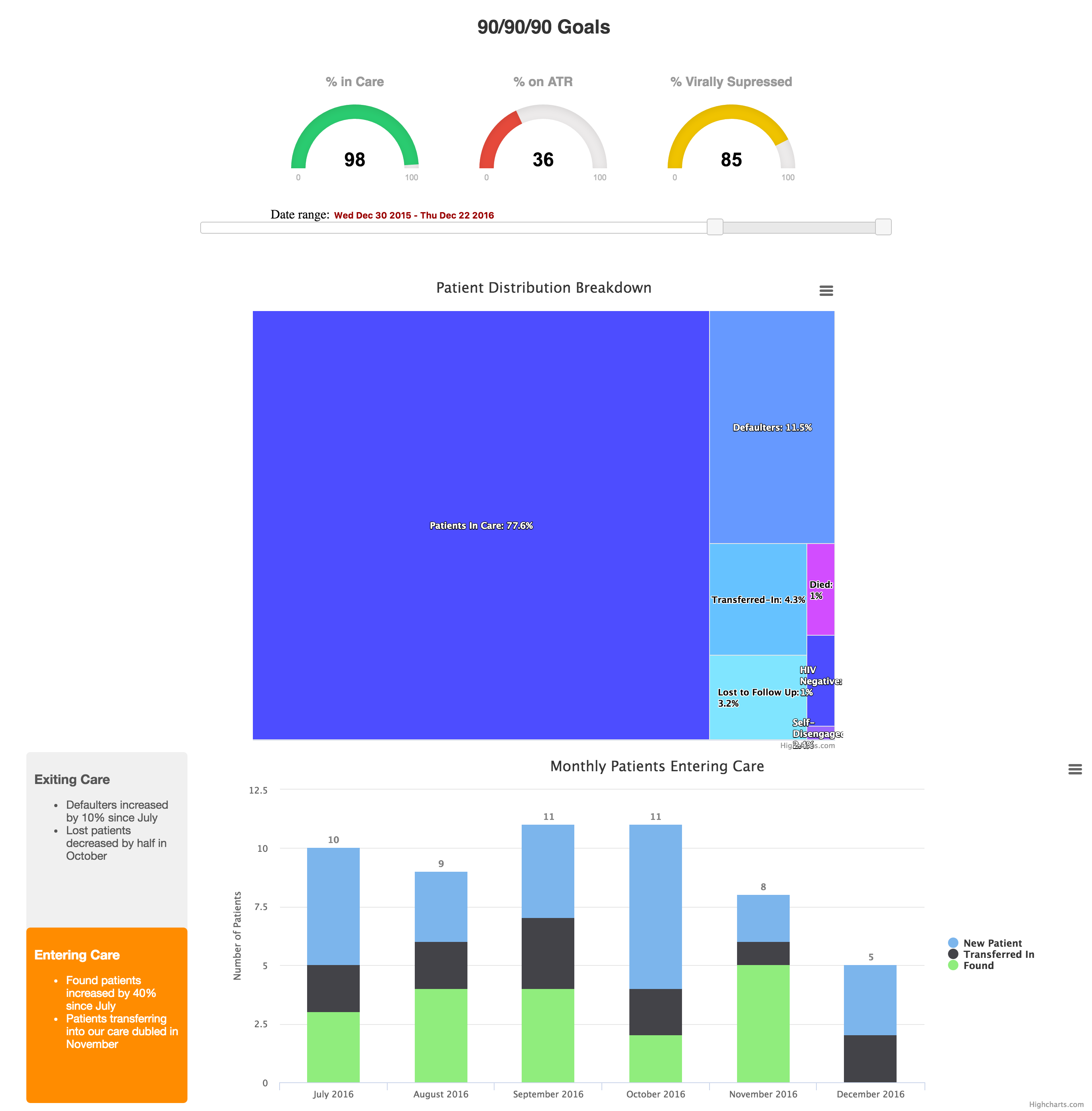
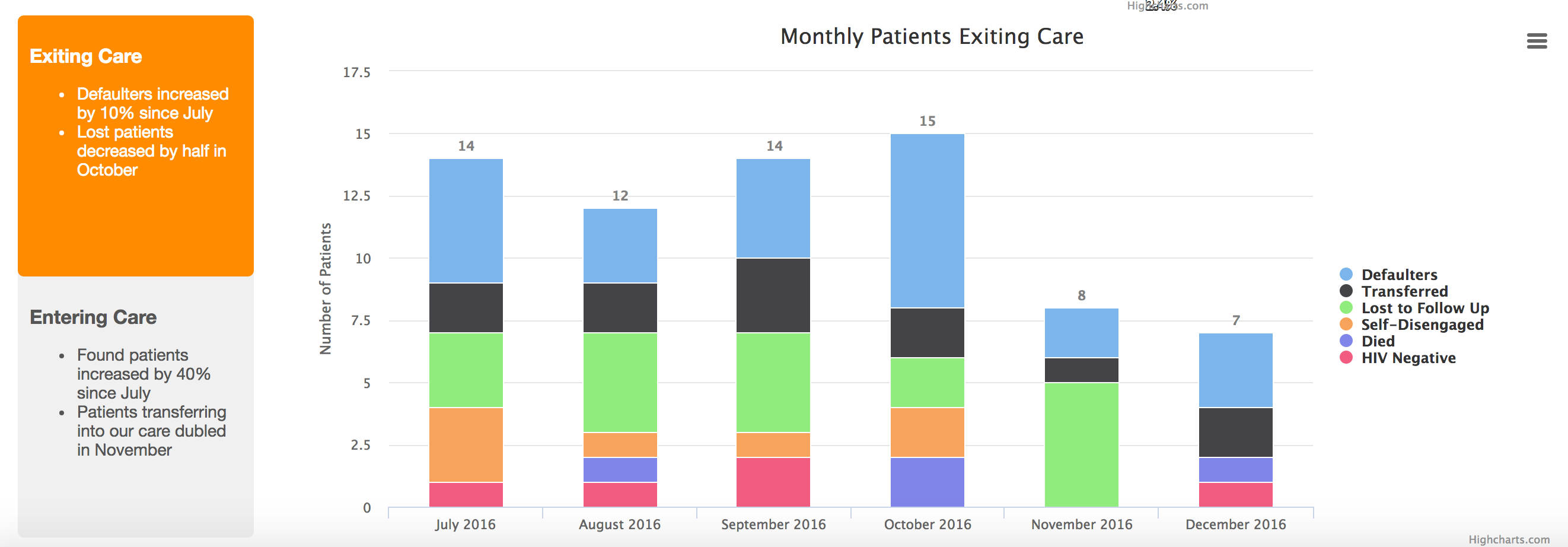
For our second iteration, we used a sortable, stacked bar chart to more clearly communicate the difference between patients entering care and patients entering care, and the categories within those distinctions. We also pulled out highlights from the data to display in the left panel. For the treemap, we updated the hover states so they provided more detailed information about each region.
NEXT STEPS
As AMPATH looks to incorporate more data visualizations into their EMR, we plan to begin user testing with the doctors who use the EMR and keep iterating on these early designs.