PROCESS
THE PROMPT
The prompt for the assignment was to create an interactive prototype for a tool that could be useful to User Experience Designers.
IDENTIFYING THE PROBLEM
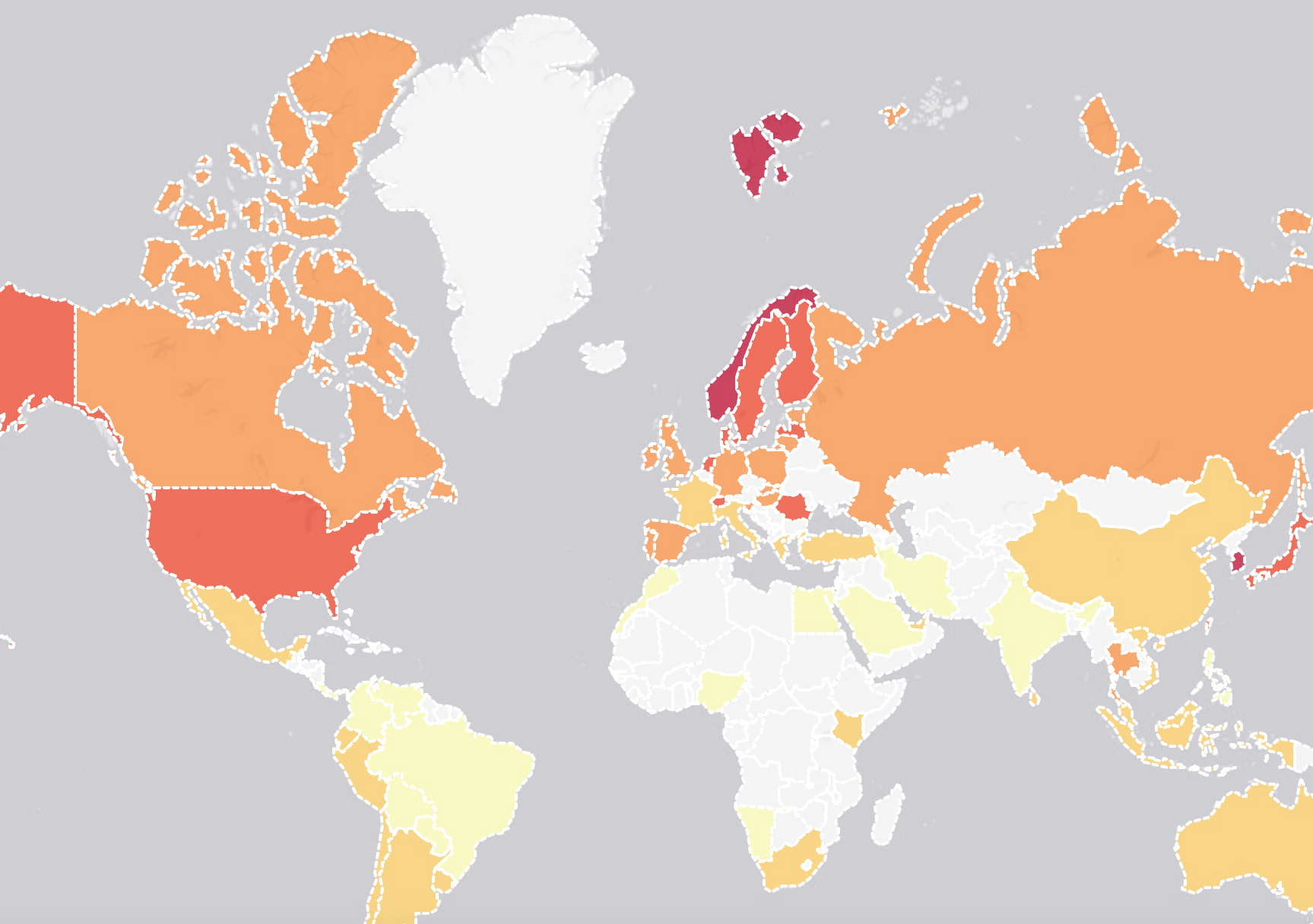
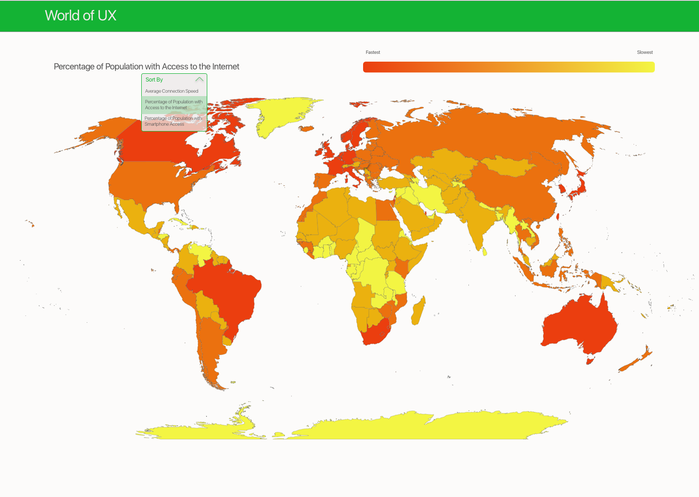
In a conversation with a software product team focused on designing for an international audience, I learned that they had recently a installed 2G network at their office after a trip to India, in order to create a testing environment that mimicked the speed of connectivity in India. Before that trip, they had not realized the impact network speed could have on their design strategy. I started wondering about how often a gap in understanding about global Internet contexts might be impacting the international scalability of other product designs.
DEVELOPING THE CONCEPT
I did some research about Internet connectivity around the world, and started to develop a list of variables that would be important for designers to consider when they build products for international users. I verified my list by sharing it with designers who have faced this problem and incorporating their feedback.
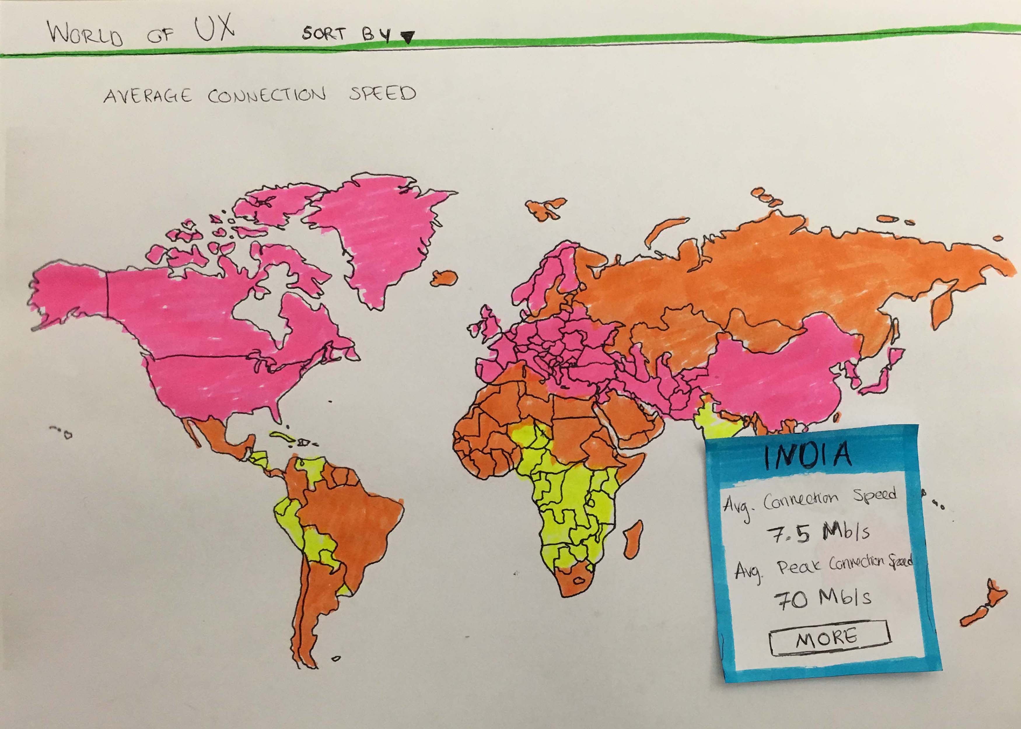
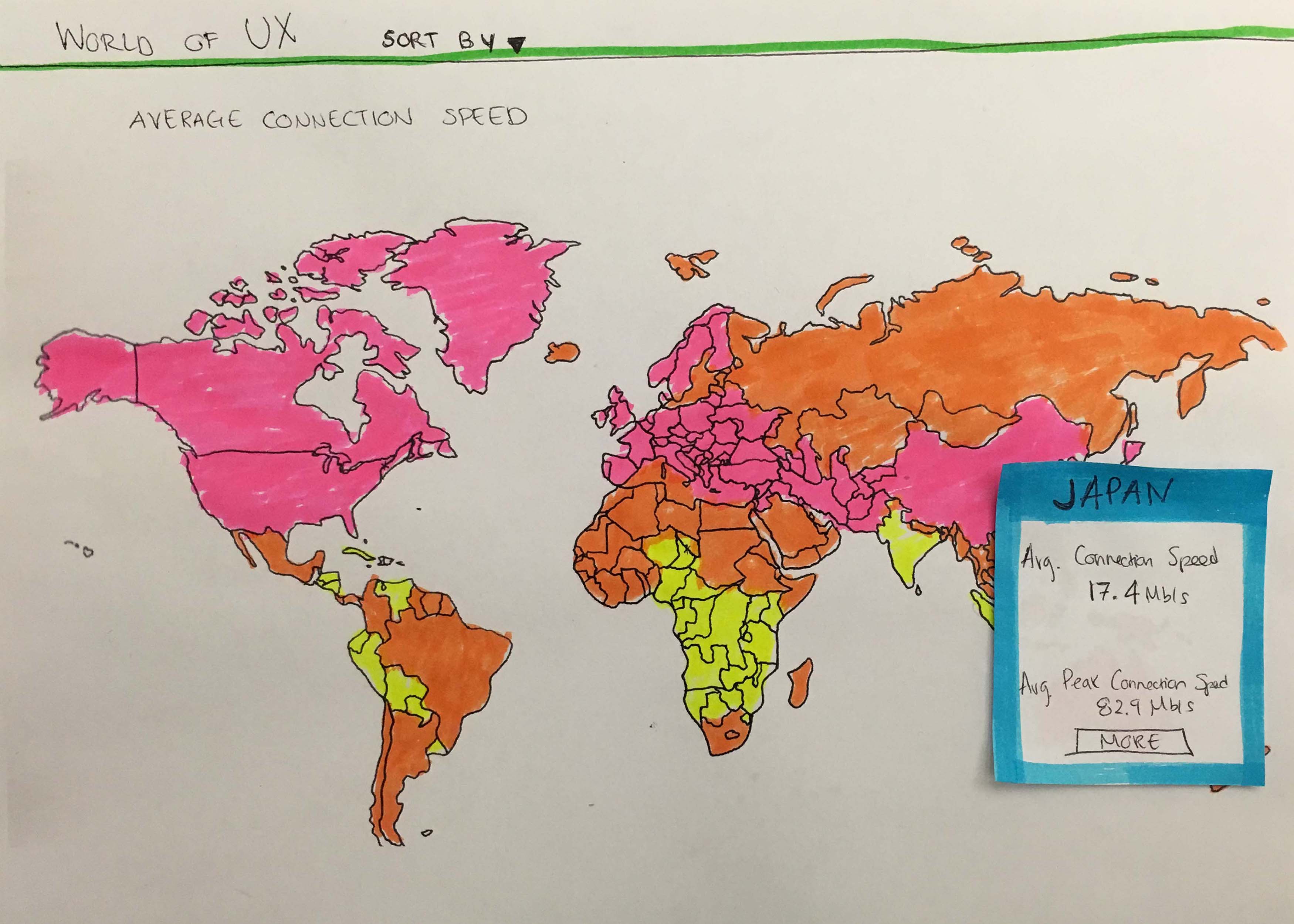
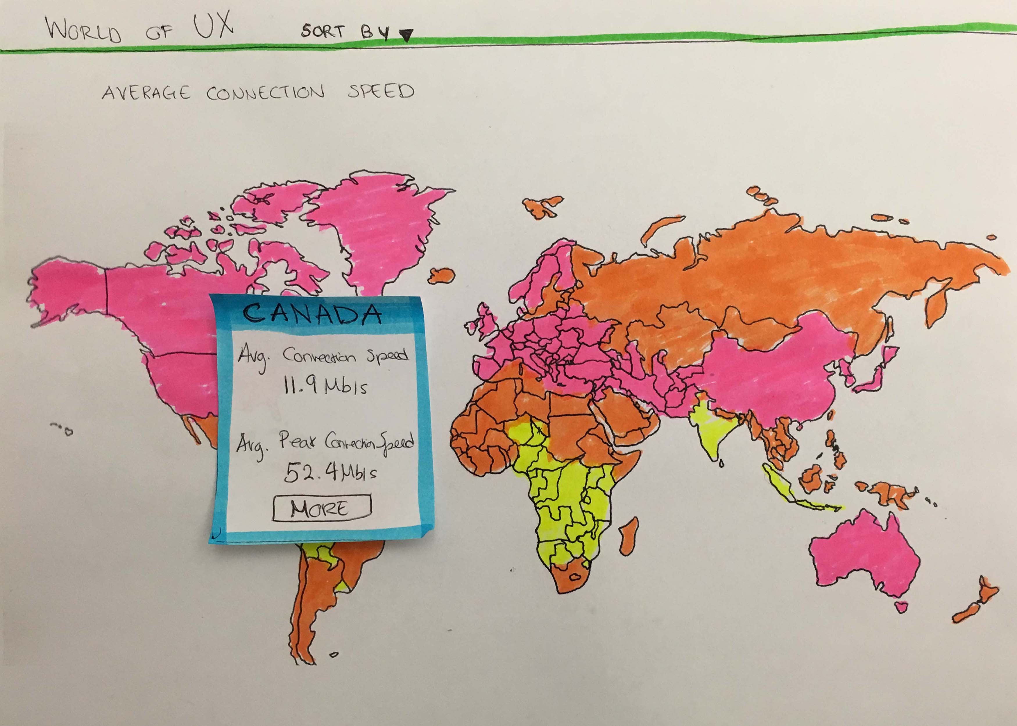
PAPER PROTOTYPING
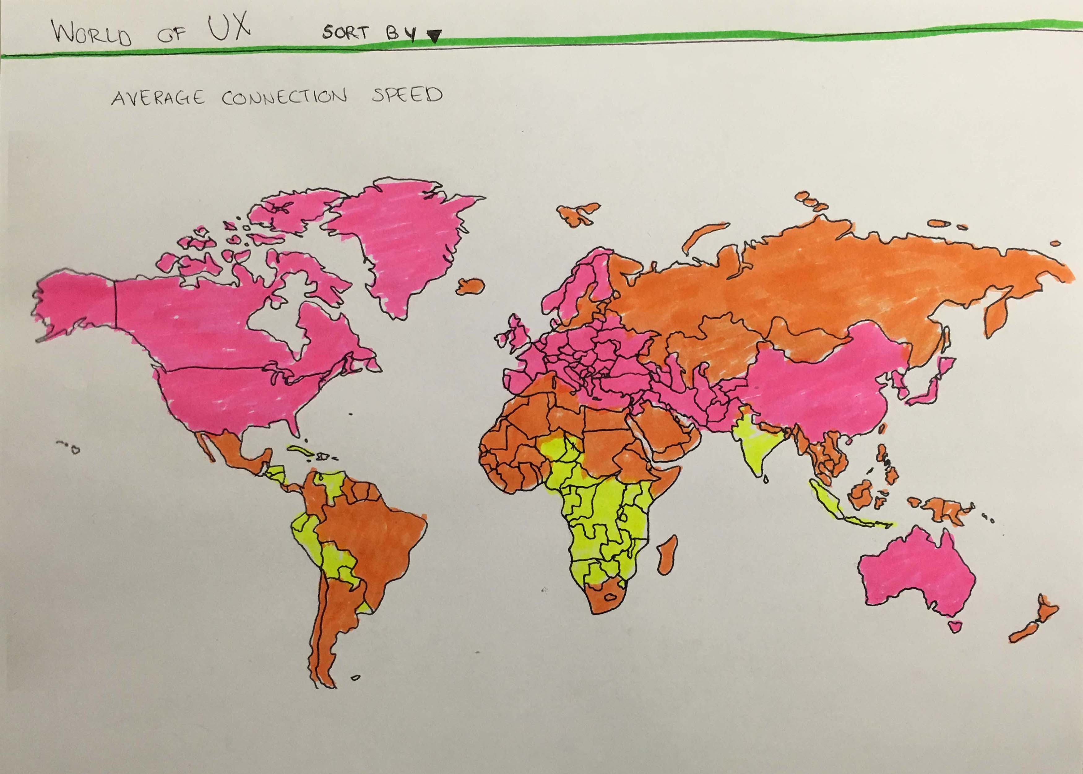
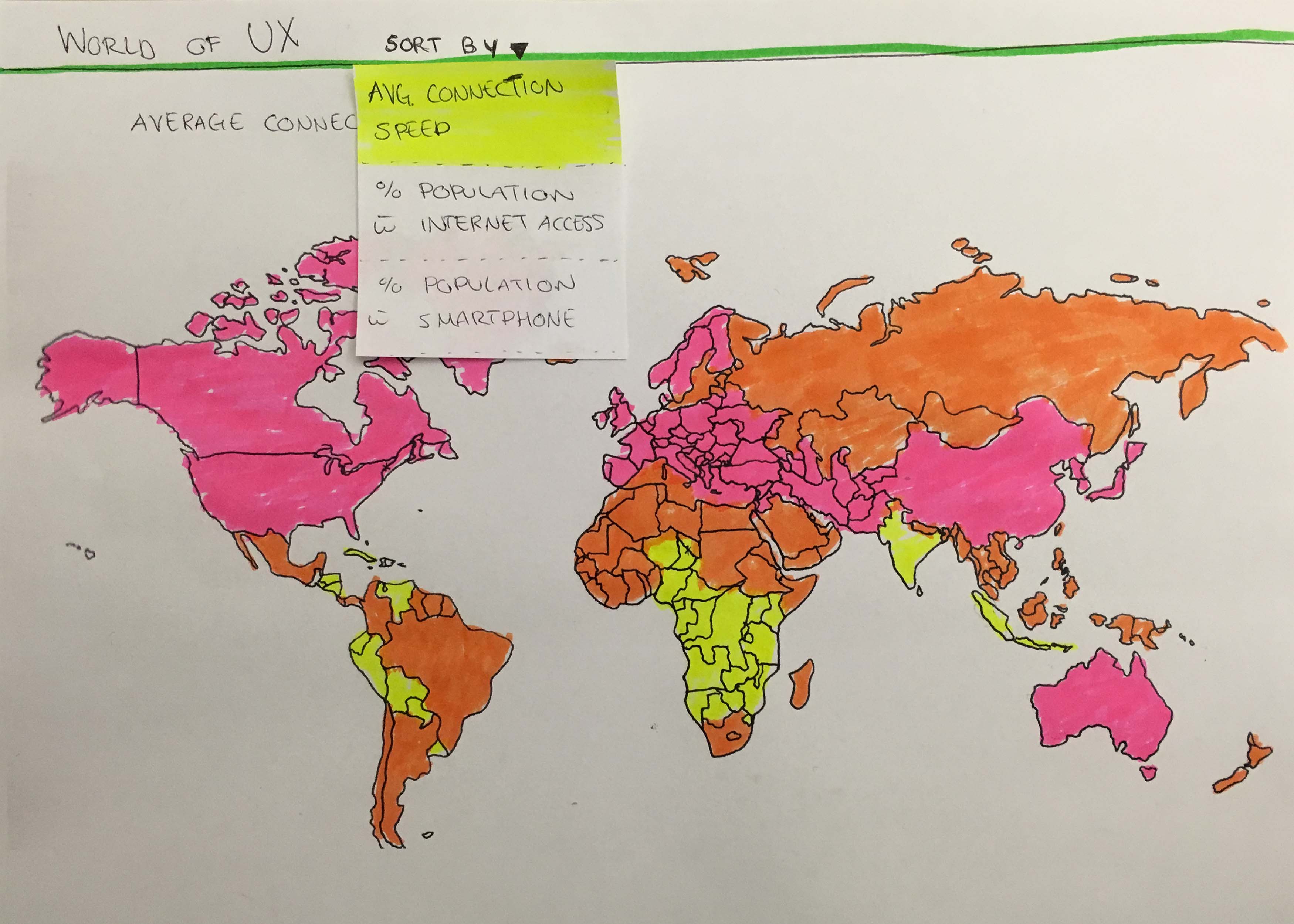
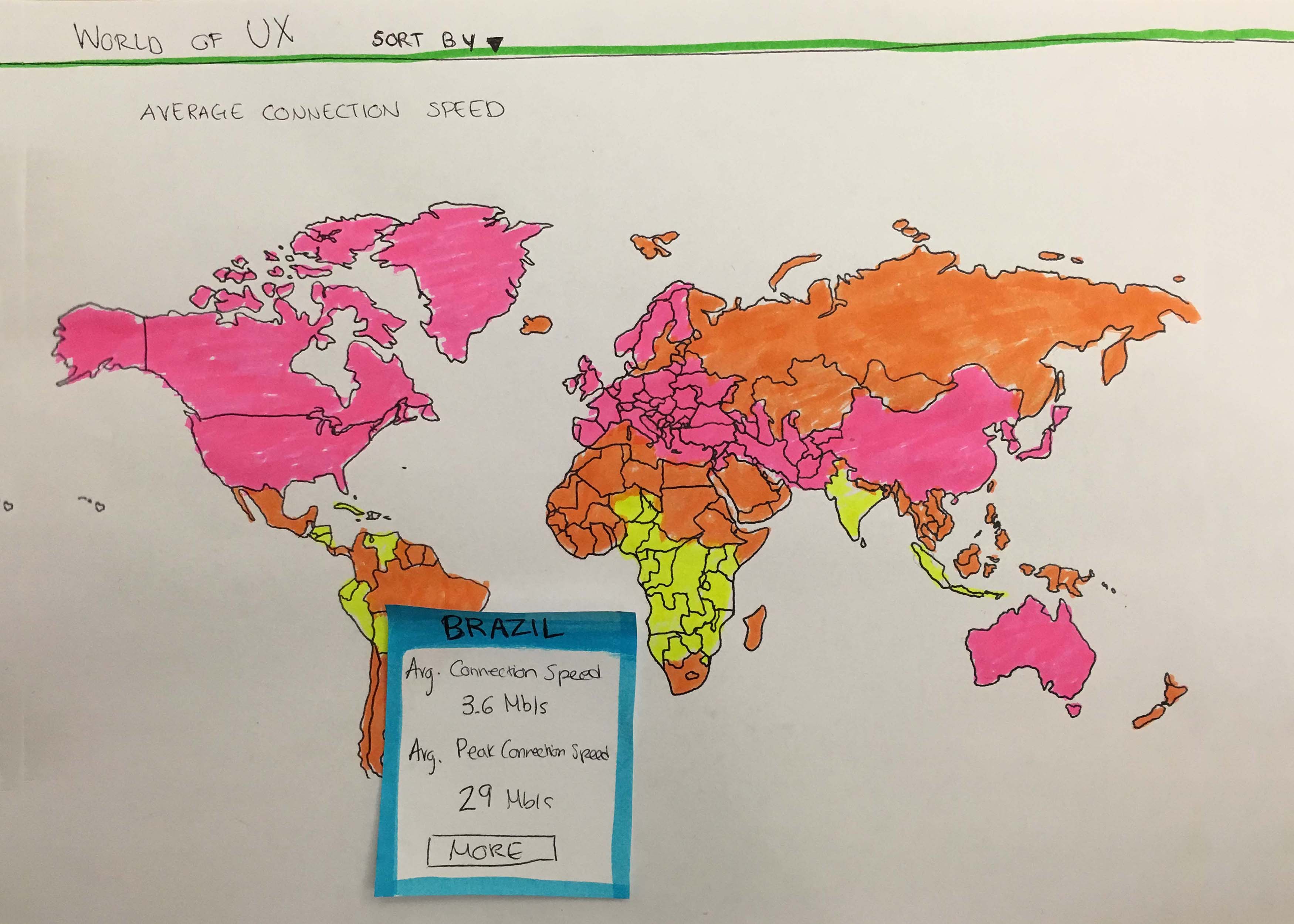
I created paper prototypes to help me gain a visual understanding of the information the tool needed to display. Once I had a workable paper prototype, I tested it with users (UX designers) to further verify the concept and identify ways to improve the design.
DIGITAL PROTOTYPING
Based on feedback from testing the paper prototypes, I created higher fidelity prototype screens and used inVision to conduct additional user testing.
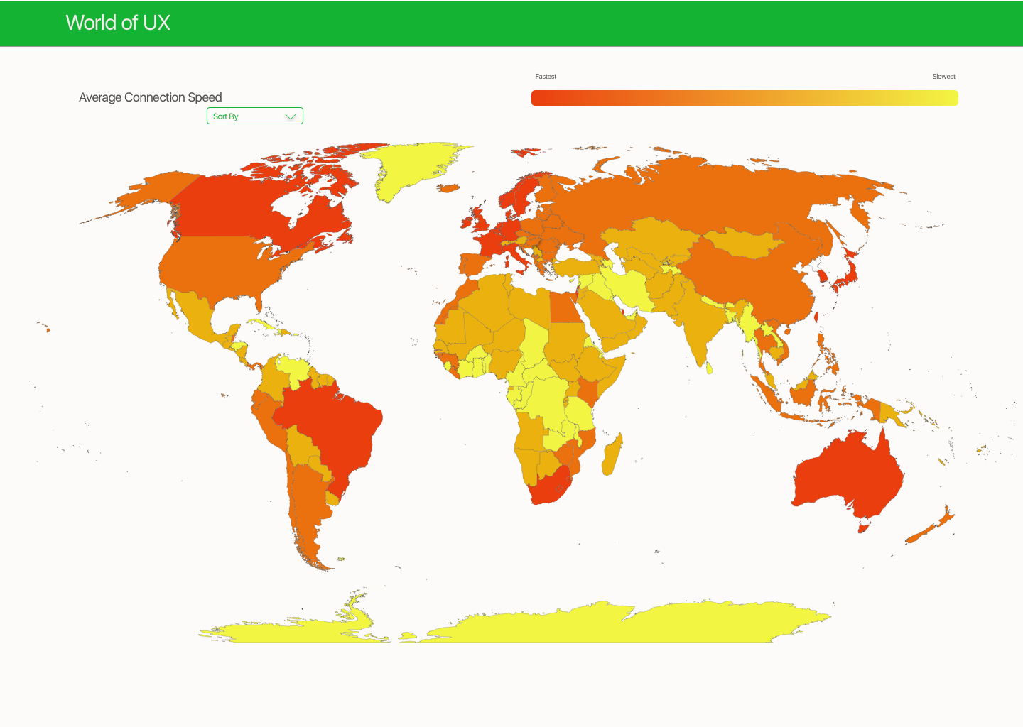

MAKING IT INTERACTIVE
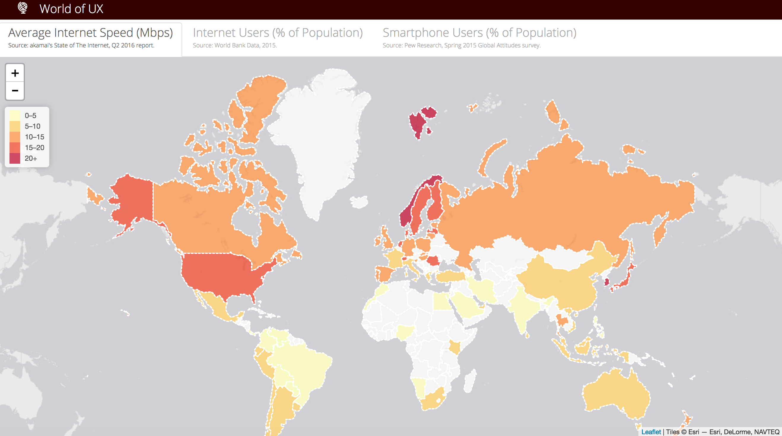
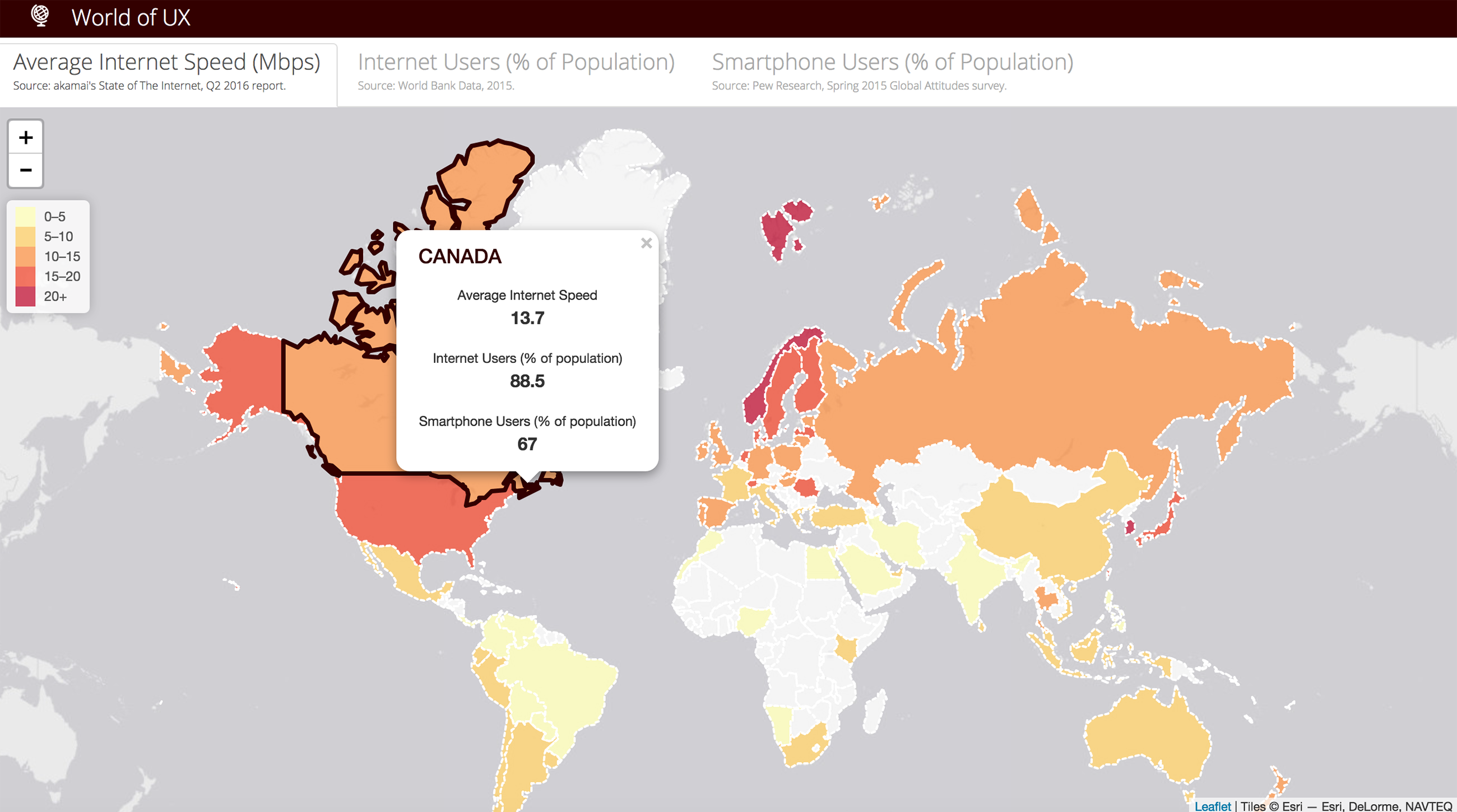
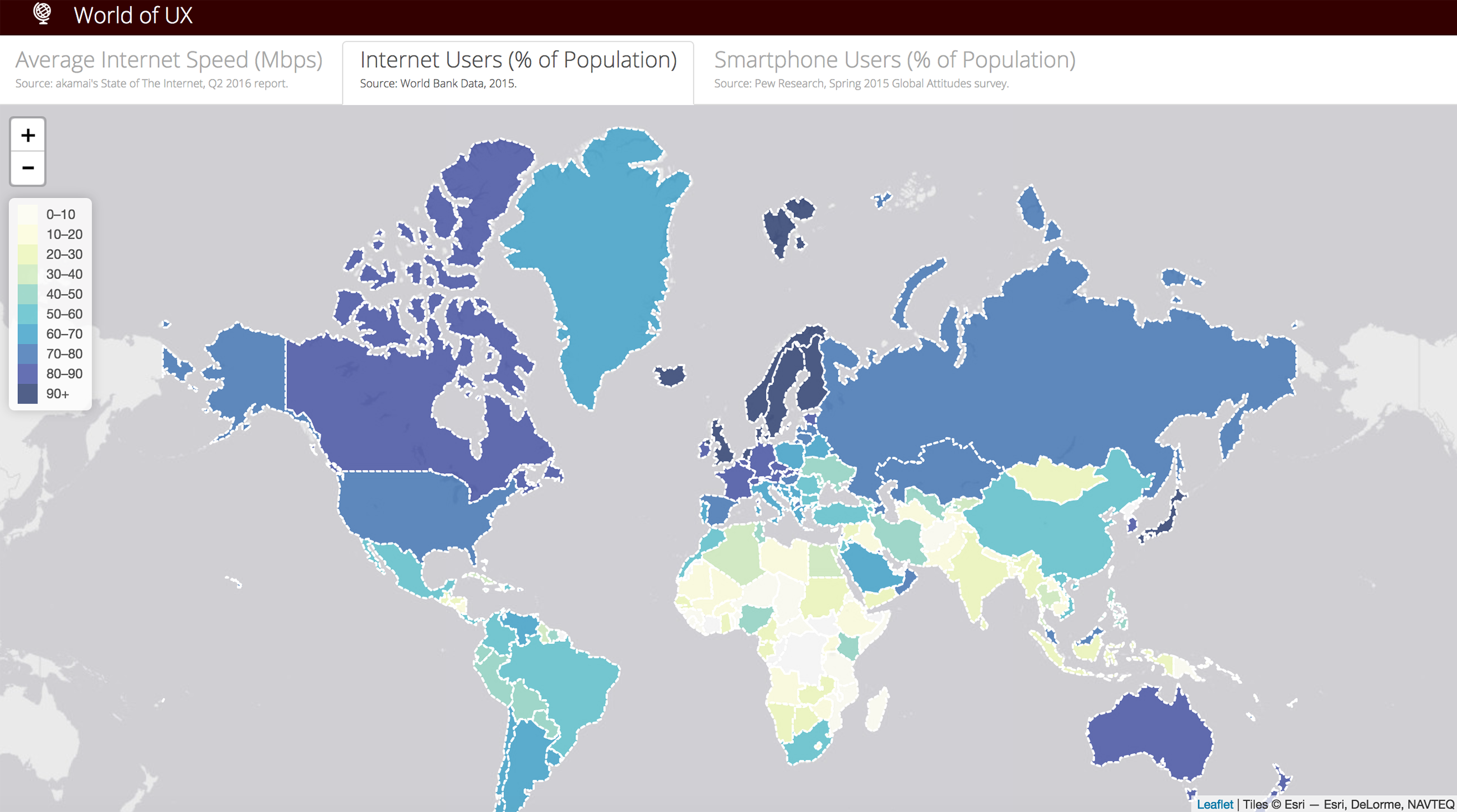
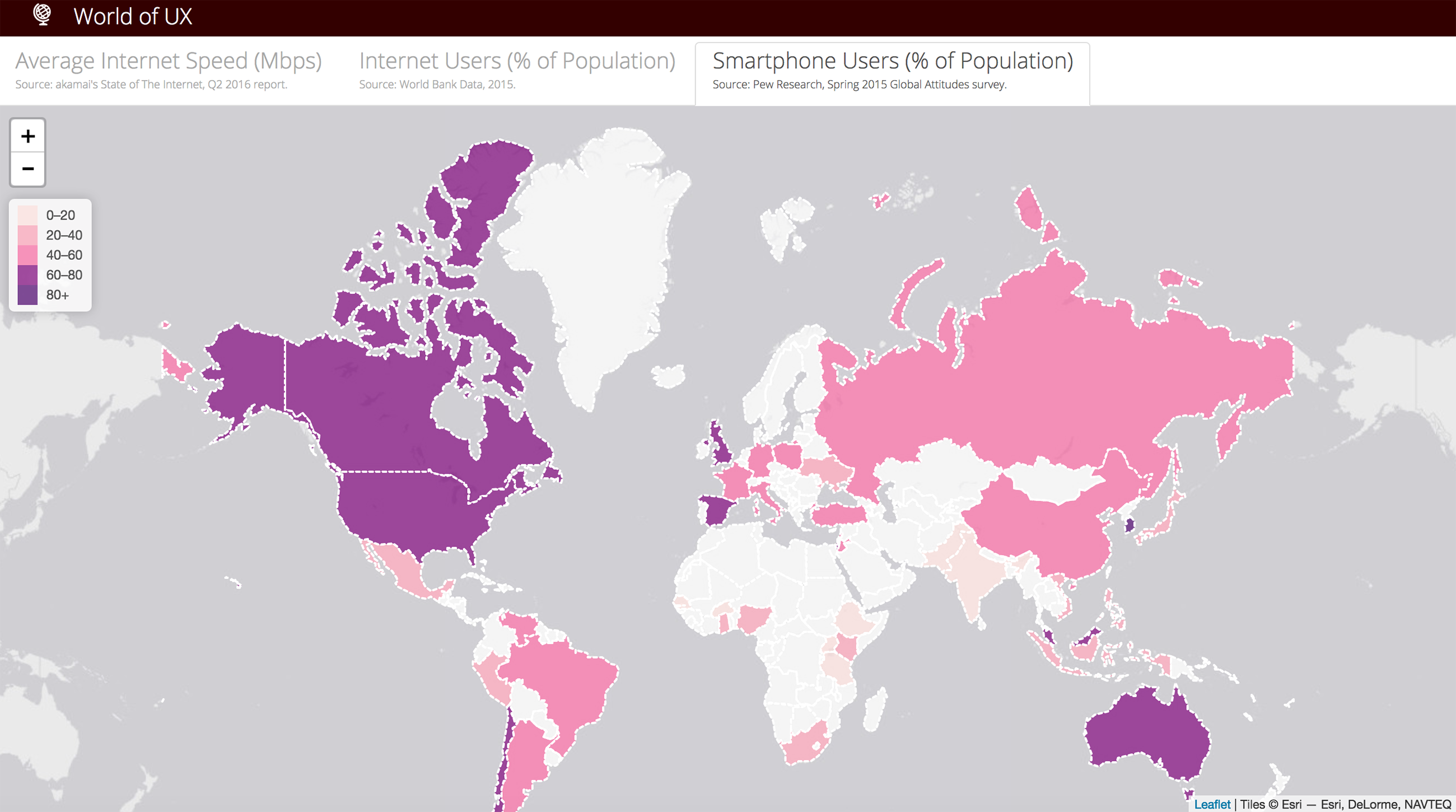
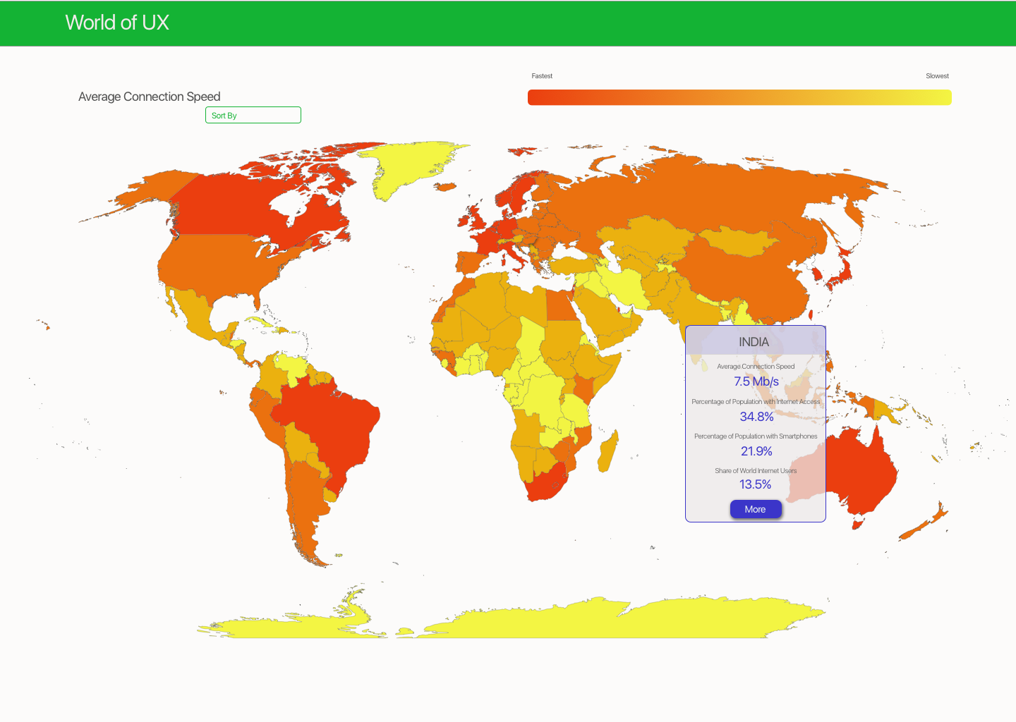
To build the fully interactive prototype, I used leaflet.js, a javascript library for geographic data visualizations, formatted public data from trusted sources into a geoJSON file, and assigned each metric a color gradient to display each country's values. I implemented a tab navigation structure instead of a dropdown menu to make it easier for the users to see which datasets are available from any screen.